

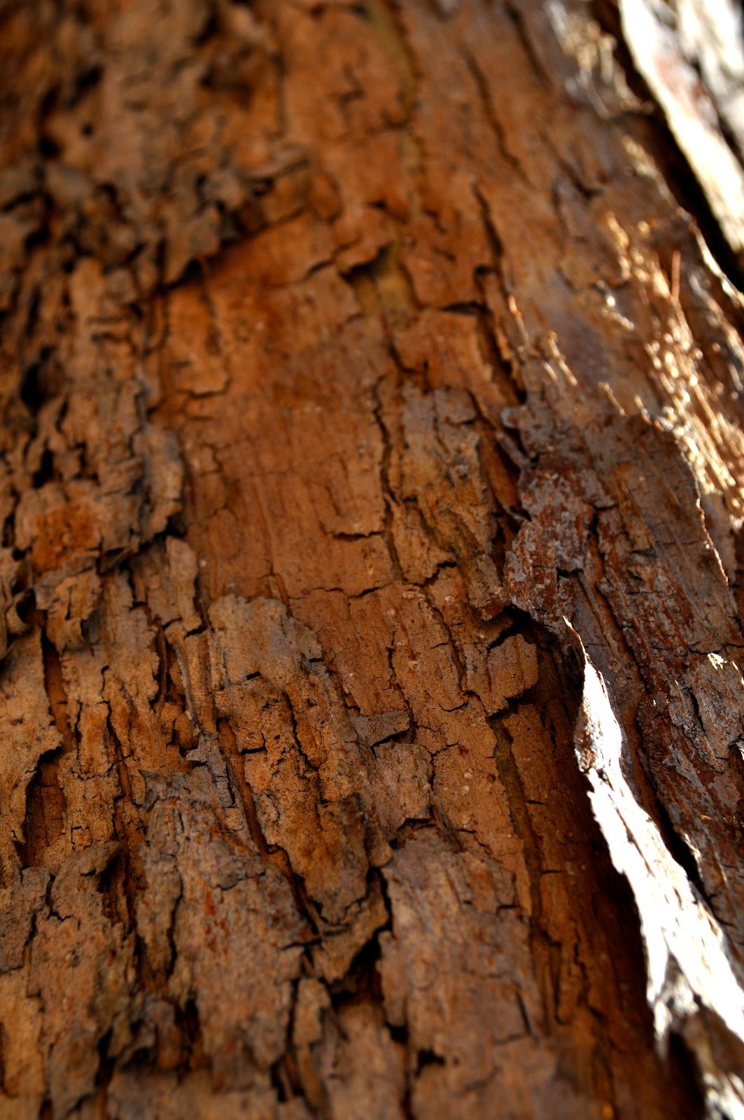


For my second draft i tried to only focus on the texture and have no background. I wanted to remove the context of the texture so it would not be automatically evident to the viewer what the origins of the texture are. I also wanted to have a focal focus point of the textures so it was clear but also blurry and fading. I did not intentionally do this, but the colors of my second draft are cohesive and i like the way they relate to one another.
Good job. I really like your second photo because it takes a second to see what its of. I love how you made it a little unclear what each photo was actually of, because it makes it more interesting to have to look and try and figure it out.
ReplyDeletei really like your photos! they are all really good and they really stand out for the veiwer
ReplyDeleteGood job. I like your fourth picture. The texture looks really pretty.
ReplyDeleteThis is a great 2nd draft Emma! I really like the first image in this series because of the texture and the fading colors, which creates an equivocal subject for the viewer to uncover. I think you do a great job in this series with focusing on cohesive colors.
ReplyDeleteThis is a great series. The fourth photo from the top transcends the others due to its textural depth and abstract quality. I would encourage you to look out for similar affects in your photos.
ReplyDeleteI really like all the different textures in these photos! Even though theyre all different they all compliment each other in a way. Even though there are a lot of shapes and movement the photos don't seem cluttered. NIce job.
ReplyDelete